


Full cultural life is concidered to be in the center of the city; meanwhile other urban areas and districts are nothing interesting.
Or they aren't?
In the last few years, the locality trend has been increasing. Local initiatives are growing within districts, local communities are being created and developed.
For instance, in Moscow there is a galleries association, which aim is to bring actual art to the urban districts. My project* is a full rebranding of this.

what for?
– to increase brand awareness;
– to support and develop the locality trend;
– to point out the association as itself – there are many galleries, all of them worth visiting.
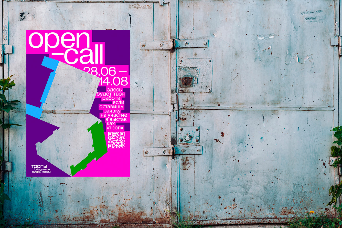
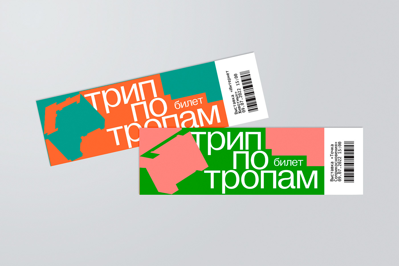
---> тропы / trails
A new naming is for a new beginning.
«тропы» (trails) are local and opposite to official routes. People make trails themselves, as needed and convenient for them. They use them daily as a routine. Also, «тропы» is for tropes – metaphors, metonymies or allegories, that are used by artists.
logo
Key metaphor of the logo is decentralization and surrounding's variability. The suitable solution to emphasize this was to create a dynamic logo.
There are some specific images in the logo as well. A point of the map, which a center flows to, means that each gallery is a center. A curve in the logo refers to a trail and also a thread, on which each gallery is beaded.
Close kerning in the logo signifies connection and affinity; lowercase expresses the idea of horizontal organization.
Color coding may be also optionally used in logos for specific galleries; color of the "point" depends on subway line's color, on which a gallery is located.


main concept
Galleries are located in ordinary houses, mostly insignificant and with no historical value. This is the base for project's idea development: a sad house in the urban area becomes the real art; therefore, the street becomes the gallery.


key visual
The concept of decentralization and surrounding's variability is supported by graphics throughout the project.
For each gallery a form of its building is used in compositions. This is the key graphic element, which is always exposed in a different way, at a different angle. It can be a placeholder and it can keep the whole composition together; it stands out from the surrounding and dissolves in it.
Vivid dynamic blocks support the idea. Each time they are different as they transform. They appear in new places and in new configurations – like a volatile environment. They are like trails for typography.
Colors in the project are vivid and bright, they give a union a clear voice, get attention and form the "one step short" tone of voice. In most compositions two colors and white are used.


this is a study non-commercial final university project


